Brewer’s Reference
Chambers
We rebranded the Brewer’s range of reference titles with a solution reflecting the eclectic, eccentric and involving nature of the books themselves. We developed a brand proposition highlighting the quirky nature of the content, ‘The Scenic Route to Knowledge’, or, as Terry Pratchett commented, “This is, in fact, not what you were looking for; but it’s much more interesting”.
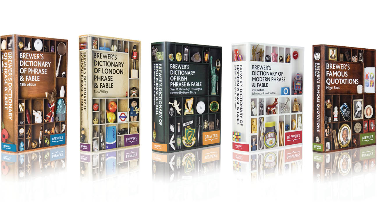
The brand mark and visual language based around the concept of a cabinet of curiosities gave the brand a distinctive look and feel.
Learn More
The ‘soft reference’ market had undergone something of a renaissance with the increased popularity of books such as Schott’s Miscellany, television programmes such as QI and online resources such as Wikipedia.
The Brewer’s range of titles are a much loved, diverse and a slightly unconventional reference source. However, they lacked any coherence as a series, with an absence of any brand as such. The challenge was to develop a brand that made sense of the existing Brewers collection, with a view to taking the existing assets online and bringing a consistency of design and approach to the books themselves.
There was an opportunity for Brewer’s to carve its own niche in this market but the range lacked any coherence as a series, with an absence of any brand, which would help to increase awareness of the collection.
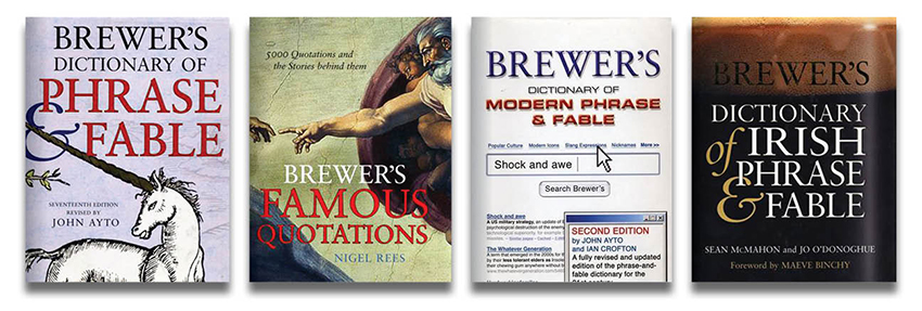
Previous Design, not by NextBigThing
The brand required a solid foundation, differentiated from its competitors, that would ensure it could move forward and be successful in a multimedia brand landscape.
We created a brand positioning of ‘the scenic route to knowledge’, echoing the diverse nature of the content of the books themselves. This was visually conveyed through the idea of a cabinet of curiosities, displaying a wide range of ephemera that related to the facts and information found on the inside. In this way each title was unique, yet visually consistent within the range.
The approach was an overwhelming success, with the titles being heavily subscribed not only by existing booksellers but also key online retailers such as Amazon. The digital application on the Brewers website also became an instant hit with the growing Brewerphile community!